Friday 30 September 2011

ANATOMY OF TYPE


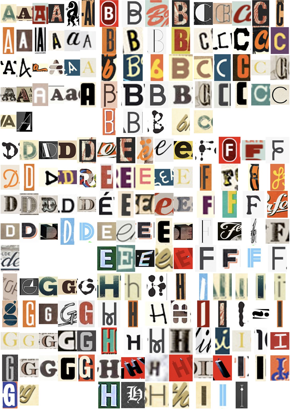
PREPARATORY TASK - SESSION 1
-5 DIFFERENT LETTERS WITH DIFFERENT LETTER FORM FOR UPPER AND LOWER CASE.


TASK 2 -  TYPE, FORM, ANATOMY


TASK 3 - TYPEFACE, FONT, FONT FAMILY


Regular Black Roman Bracket


 (left to right) Bold condensed, Regular, Light


(left to right) Bold condensed italic, Regular italic, Light italic


Gothic crossbar regular black


Gothic pyramid regular black

Roman serif mix regular black

Learning about The anatomy of Type has been very interesting there is so much to learn about type which is amazing since most people just look at typography as letters, when there is so much more to it. from doing these workshop and listening to presentations I feel a lot more comfortable with typography and not as intimidated by the fact that I don't much about it, as now I do know alot more and I also now know that no one knows everything about it unless they have been studying it for years, it's not something you learn in just one week its an on going learning process.
  

Saturday 24 September 2011

Finished Piece.


After we had our crit with another group we decided to make a few changed such as adding the 'not' in the title so i now reads..'How to (not) flag a taxi as a student' as we realised it wasnt informing the audience 'how to' it was informing them what not to do. We also realised we had missed out the element of whity dry humour in the text of the poster so we added this too.
I am very happy with our outcome as i think it serves the purpose we wanted it to, by informing the audience how to behave in a humourous way and also added another function of use by adding the numbers of taxi ranks in Leeds which makes this piece multi functional and so i think it will appeal to people.


How to flag a taxi..


 These are some of the initial drawings done from the photographic research we gathered. The illustrations were scanned into the computer and traced on photoshop, then had colour and texture added to them. The layout was then come up with which we based originally on this structure that we came up with.

I think the layout with have got started is going well as everything is clear and neat but with an edge that makes it interesting and eye catching. The colours also work really well with the 'retro' theame we are going for.

Friday 23 September 2011

Summer Project.


10 letter examples from summer project to produce alphabet that represents yourself.