Tuesday 24 April 2012

OUGD 404 evaluation


1. What skills have you developed through this module and how effectively do you think you have applied them? 

In this module I feel I have developed and learnt many skills that I was not as well educated before. Like for instance the anatomy of type, I knew the very very basics of the anatomy of type but no where near as much as I learned in this module and also the fact that we learnt how to apply what we learnt really helped through the pratical nature of this module. 
Another skill that has proved to be incredibly useful is the use of grid and layout. I now know how important it is to use a grid when designing layouts. I also gained the skill of using Indesign which is a software I now use on a very frequent basis during projects.
Awareness to colour is another skill I feel I have gained, I now know more about the theory behind colour and feel I understand it more and have been able to use colour in projects with more of a rationale.
I also feel I have gained skills in Idea generation in a different way as this is something that we explored with the publication and what is a line briefs, taking a starting and point and seeing just how far you can take it.


2. What approaches to/methods of design production have you developed and how have they informed your design development process? 


I feel that learning the fundamentals of graphic design in this module has helped me massively in my design development process as I now feel more informed in what I am doing, and I am more aware of just how much there is to learn. 
Doing the grid and layout workshop has effected the way I work a lot as I am now aware of grid systems that i wasn't before and so when it come to designing my own work I am more educated, I also could see the importance of drawing out accurate layouts before digitally designing I found this a really good method of working and is something I will continue to use.


3. What strengths can you identify in your work and how have/will you capitalise on these? 


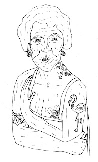
In this module I had an opportunity in a brief to screen print which is an approach in design that I really love and feel it was a strong point in this module. I will capitalise this by experimenting and developing this skill more. Another strength I feel I can identify is learning about the anatomy of type, although I know I still have a lot more to learn about it, I found it really interesting and enjoyed investigating it further. I also enjoyed being more colour aware from the colour theory I now feel when I'm looking around at things more in tune with colour and more able to notice what is going on with colours.


4. What weaknesses can you identify in your work and how will you address these in the future? 


My main weakness is my bad time management which effected the way I managed projects. I really regret not making and time , letting other briefs and modules come first, to re address briefs from this module more than what I did as I feel I could of gained more. This is something I won't allow to happen again as I can see how I have missed out.


5. Identify five things that you will do differently next time and what do you expect to gain from doing these? 


- I will do more research into the principles as well as practical  as this will give me a greater  
   undertaking.

- I will manage my time and make sure that I re address briefs until I feel I have a good    
   understanding.
- Explore colour theory more as this is the one that I found hardest to get my head around
- I want to take advantage of the resources we we're shown such as the photography studio session, as this would be good when photographing end products or  if any future project contained photography.
- Take more detailed notes whilst listening to presentations, this is something I find difficult listening whilst taking notes as I feel I miss things/don't take the information in as well, but if I try work on this by having detailed notes it will give me something to reference and look back on.


Attendance: 4
Punctuality:
Motivation: 4 
Commitment:
Quantity of work produced :
Quality of work produced: 3
Contribution to the group:


WHAT IS A LINE

What is a line?


My chosen line is - Wrinkles
My chosen like is - Flamingos
My chosen logic is - publication

Brief Title: What is a line...

The Brief : Wrinkles > flamingo> publication
                   selecting a process and working with the brief title 'what is a line ' you are required to produce    
                    a graphic visual on your 'like'

Considerations: Process, line, like

Mandatory Requirements: All visuals should be investigated with a broad range of research, design sheet,  
                                          note books and on going documentation on the blog.

Practial Considerations: no media restrictions, what possible process are there

Deliverables: graphic response

studio deadline : 24 th april


When trying to think of ways to connect wrinkles and flamingos I came up with a number of things such as designing a womens anti wrinkle cream etc but then I thought about tattoos and how they wrinkle and age and this would also be a way of combining the flamingo too.


Rationale:


After doing research about how to preserve tattoo I've decided to vier off from the concept of informing people how to stop aging tattoos happening as there is not a lot you can do and the things you can do to stop the ageing of a tattoo are really simple things. Instead I want to make an entertaining, interactive book about how old people with tattoos are cooler and younger, with a smaller section about how to maintain tattoo. I am going to attempts to do this through poems as I feel they can be humorous and fun.


The Grandma with the flamingo Tattoo.


These are the scanned in drawings that I have been doing for the book, now they are finished I will have a play with how i want the colour wise etc.

How to make book interactive?

The first way I thought about how to make the audience interact with the book is by making the book playful for example having things appear or disappear or pull out, I will research into books like this .

Another way is by including some transfer tattoos, I have sourced the paper for this and I am happy with the outcome, although I forgot to cut down the transfer before sticking it on my hand so tried to cut it down with a scalpel whilst on my hand and it didn't work too well, but eventually I got the overall effect I wanted to achieve.


Old people development:


I do like the use of colour on the tattoos but I feel it becomes a little too garish and less tattoo like as the colour is solid and flat.


I think the use of greys works a lot better it adds more subtle tone to the tattoos like you would get from a real tattoo. 

Cover development :


For the cover I wanted to use a 'Tattoo style' font, I downloaded 3. The simplest one, just above, is the font I think works the best, as the others are quite hard to read. This font is names 'cute tattoo'. The cover that I think works the best is the last one, this is because it is simple but eye catching which will get people to notice and read the book. I think the font also works well on it as it will mean that the audience will immediently be able to recognise just from looking that this book has some connection to tattoos.


Pattern for inside page:


I want the pattern for the inside page to be really eye-catching and intriguing but at the same time not give anything away.

Font for inside book:


From looking at a range of different fonts I could see that certain fonts really did not suit what I was trying to achieve, I decided as the content of my book is poems to  use a classic legible italic georgia.

Lay out

Now that I have all my content for the book I am able to start putting everything down to a lay out 


Test run to see if layout/ pages all work out. Happy with results.


Turn wheel:

The way the book is going to be interactive is that on every page there is a turn wheel and when you turn it, it reveals the old person with the tattoos. The following is my experimentation into how to achieve this.


From practicing with sticking paper down I discovered that the placement of the OAP is essential to how it works. they have to be placed in just one half of the circle otherwise when the wheel is turned the image of the old person will not be fully hidden.


I have decided to attach the circle disk to the book by sewing it with clear string. The stitches will able the disk to turn and the clear thread doesn't look unsightly.


Finished Piece


Evaluation:

I am overall very happy with the book I have made There are a few alterations I would make if I were to re address things such as the turning mechanism, if I had more time I would of liked to find a more substantial way of fastening the disk to the book as sewing it with thread has not proved very durable as it keeps breaking. I would also change the way I stuck the pages together as the PVA made a mess and made the pages buckle. Apart from that I am happy, I have achieved what I set out to make, A humorous book about old people and their tattoos that the audience can interact with and respond to.