There has been a lot to take in this module, pretty much everything we did was something we hadn't done before, but had to familiarise ourselves with very quickly to then use it in our work. It has been intense but I feel like I have gained so much in skills and knowledge just in this first module of second year. There are numerous skills I have developed in this module such as to start off with, designing for print. Before this module I knew the basics such as different colour modes, stocks, but no where near the knowledge I now feel I hold. I feel like I could comfortably send work of to be printed and be confident that it would come back how I want it. The skills I've picked up from designing for print, are skills that I will take forward for good, they are skill you need as a professional and we are lucky to have been taught them at this early stage in our careers. Another skill I have learnt is web design as a whole. I have really enjoyed getting to grips with web design, although at first it seems hard once you get the hang of it, it feels so rewarding. The fact that in a just after 4 or 5 taught lessons you are able to create two working websites makes me feel like I have definitely achieved something this module, and although I have a lot more to learn about web design, I am feeling good about it and wanting to develop my web skills further. I feel my research skills have also vastly improved and I think this is thanks to my summer of over researching Stephen Fry, seeing how far I could delve and research and obsess into Fry during the long, long summer made me realise how far you can push any research, but I just need to make sure that I can home it back in and not get lost in it.
Research has made me more aware of the possibilities of design and how far you can push them and experiment with them. It has also ables me to look more into contexts of graphic design something I could never quite get my head around last year, but now fully understand. Research is also a major tool for determining how to target your audience, and so is something I aim to keep going and try make my research a high standard and document it better.
I feel like the skill I learnt in first year have also improved, such as lay out, presenting my work, design choices. My layouts are a lot more accurate and better executed then last year and this is partly to do with the extensive software tutorials we had which have improved my software skills and also partly because I feel I am a lot more intune with my design work.
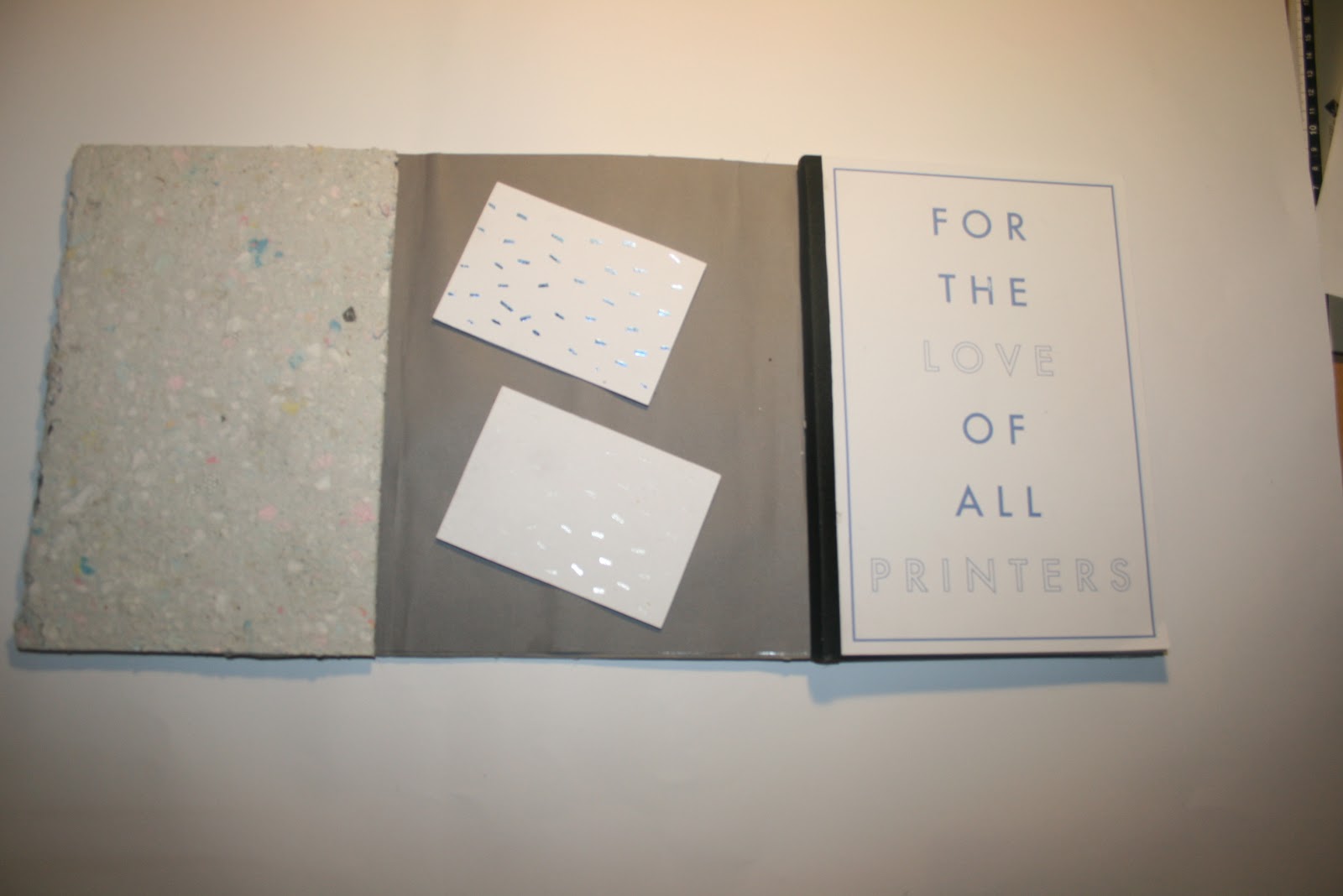
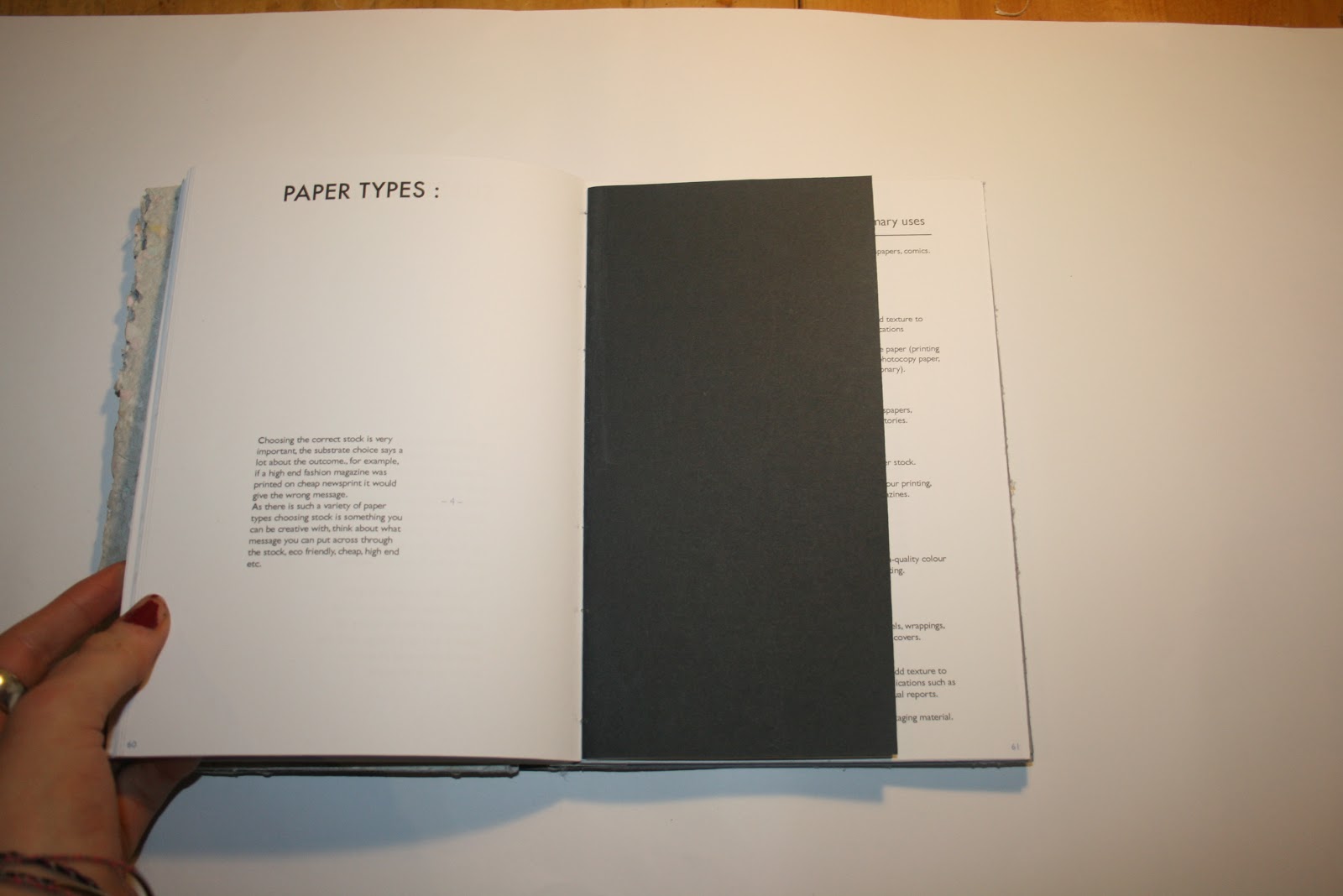
My strengths in this module have been my ability to pick up web design I am happy with the two websites I have created, although i'm sure both could probably be improved if I had more knowledge of web design, but for now, for the skills I have I am happy with them. Another strength I feel I have is the ability to try new things, I have been quite experimental in this module, tried out obscure printing methods and creating my own paper for example, and although I know such methods would never be used in the real industry, I want to experiment and create interesting and innovative things whilst I'm not there yet, I want to play and that way come up with creative graphic design.
My weaknesses in this project has been time management. I felt like I had everything under control, but then all of a sudden that control would be gone, and I think this is due to spending too long researching. I think from now on I am going to try and set myself time scales, and only designate a certain amount of time to the bulk of the research, obviously extending if I fail as i know how important good research is, but I just need to learn not to get swamped in it and taken over by it. Another weakness would be my ability to create a quality piece of crafted work, my finished pieces often don't look to the high standard I want them to in my head due to the fact I am not very good at the last hurdle when it comes to putting things together, cutting, glueing I'm a bit slap dash, but by accident. I really want to have beautiful end products that look professional, but due to poor time management I don't leave enough room for mistakes at the end so just have to hand in the end piece even if it is a bit dodgy. Although I did leave just enough time to correct and re - print my print manual which I am really please with and glad I got done. Another weakness I feel I have is not being able to photograph my work in a professional way or mock things up in adobe to put things in context, these are skills that seem to be very much needed as it really does make or break your finished piece of work how you document it, so I am going to try gain these skills.
5 Things I would do differently next time are ...
- Write lists and plans and stick to them. I started this at the beginning of the year for the first 2 months and I felt far more in control of my time and my projects but then I got behind on one list which had a domino effect. So I will start a fresh with a new list and this time follow each list through.
- Use my blog more efficiently and keep on top of it more / figure out what to blog and what not to blog
- Use tutor surgeries, they are beneficial and I think I would have gained from them, but due to lack of organisation I never felt prepared for one. So next time I will use them.
- Source more primary research instead of researching about say audience all online, I need to get primary research as I feel this is a more informed way with secondary research in gaining understandings
- I want to improve my presenting skills, when presenting my work as no matter how simple the concept I always manage to over complicate things when presenting. I also want to improve my design board skills homing in on what information to put on what is relevant etc and design boards are very important
5= excellent, 4 = very good, 3 = good, 2 = average, 1 = poor
Attendance
5
Punctuality
5
Motivation
3
Commitment
4
Quantity of work produced
3
Quality of work produced
3