Saturday 15 December 2012

WEBSITE : CRIT

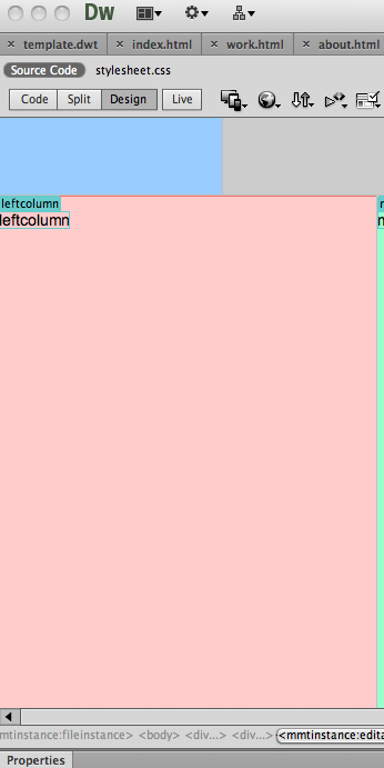
This is how my website looks as of moment. I have managed to create the index page fully including all the roll over images and pages that they link to, but have not as of yet finished/ started the pages that they link to.


Crit flagged up some areas for me to concider such as enlarging the side colour key which is something I agree with as it is a touch on the samll side. Above in the pink is the list of things I need to do after this crit .


Thursday 6 December 2012

WEBSITE : CONTENT

Content:

index page : 13 links to other pages.

page 1 : information page : 3 links : back to home page, Fry twitter, Fry website

page 2 -13 : feature fact about fry: 1 link : back to homepage


Facts :

- Fry went to prison : personal
- Got nose from playgroundd accident : school
- Number of ties worn on QI : stats
- Fry got expled twice : school
- bi polar / tried to commit suicide twice : personal
- received the most whacks at school for stealing money and sweet : education
- hugh Laurie - showbiz
- allergies - personal
- Jewish concentration camp : personal
- first tv appearance : showbiz
- Rowan atkinson wife : personal
- questionnaire answers about fry : stats

Saturday 1 December 2012

WEBDESIGN : WIRE FRAME DEVELOPMENT

This is the development of the website. I started by drawing out a neater version of my previous scamp.  I decided on the below layout for my website as I think it will give a clean look and also have a good usability.


I then started mocking things up in photoshop using boxes to map out where I'd want things to go.


Wire frame:

Once I had the boxes in the correct places on photoshop I was able to work out the exact measurements  for the website and able to produce the wire frame.


Mock ups:

Below are the mock ups of how I want my website to look. The left is how the website would look normaly and the right is how it would look if you hovered over that image showing that the image is a button this would happen to every image of Fry but flashing a different colour depending on the genre of fact.


Chosen design: 


I have decided to choose this orange colour for my website over the white as from my research I know that Fry is a colourful personality. His own website is also lashed with lot's of colour and I think the clash represents his suprisingly crazy life well. 

I will now move on to make this page into a working website.

Wednesday 21 November 2012

PRINT MANUAL : FINAL CRIT


From this final crit I had not printed out my print manual but had completed my PDF version and had my print finsih samples which got good feedback. Things that were pointed out to me were 

- no numbers
- layout issues such as things not quite being aligned right
-adding more colour 

I am going to experiment and try ammend the above and resolve my print manual, as I am happy with it but I am now aware to the issues.

WEBDESIGN : INITIAL IDEA / SCAMP CRIT

The website I am going to produce will be based on Stephen Fry. 
My audience will be Stephen Fry fans, who are web users, and enjoy learning facts. 
The website will include facts about Fry that I found out during the summer project. These facts will be about:

- Education
- Personal
- Showbis
- Stats

Initial Scamps :


Scamps for crit


Really useful feedback on my scamps. I now know that my scamps apear to have good usability, and giving off the clean simple look I want to achieve. other things that were mentioned were things like concideration of colour, font, size etc which are things I am going to imediatly move onto


Sunday 11 November 2012

PRINT MANUAL : CONTENT / RESEARCH

Print and Finish:


Production for Print :


Material, Process, Print :


Books:


I was begging to get chocked up by the internet as there is just too much on offer, so decided to get some books to aid me in my knowledge for the content of my manual. This really helped as I could see the different structures they used in their books, and how they handle the same topics but differently.