Tuesday, 31 January 2012

DESIGN DEVELOPMENT.


out of these four designs for the front cover of one of the books I prefer the on with the white boarder going around the brain as it is a good break between the two shades of pink and two different patterns. 


With these four designs I feel that the two that use the optical illusions in the back work well as it is a nice tie into what is in the book. 


DESIGN EXAMPLE


ANATOMY OF TYPE REVISITED

PREPARATORY TASK - SESSION 1
- 5 DIFFERENT LETTERS, WITH DIFFERENT UPPER AND LOWERCASE LETTER FORM.


TASK 2 -  TYPE, FORM, ANATOMY


DECONSTRUCT TYPE.


ASENDER

BOWL

BRACKET

COUNTER

CROSSBAR

EAR

LOOP

NECK

SERIF

STEM

SHOULDER

STEM

TAIL

TERMINAL

WASTE


To make sure I really get my head around all the different parts of the anatomy of type I wanted to re do a few stages from the workshop mainly concentrating on the different parts of typography.


Monday, 30 January 2012

PATTERN


This is the pattern I will be using to decorate aspects of my designs. The previous two colour are a little to washed out and dont make the imagery pop as much as the last colour does. the contrast between the bold colour and repetitive pattern really make the brain stand out, which is what i am after.

STEREOGRAM FOR T-SHIRT POCKET


These are my trails for the stereogram pocke t-shirt. Behind this image lies the logo. Although i do like the colourful stereograms i think the one that works best / stand out the most is the last one above this text. This stong pattern of black white really draws your eye in which im hopping will be the effect once the pocket is on the t-shirt

TAG DESIGN MOCK UP


After comming up with the basic label context on the design sheets I have now transfered this to a digital form to get a better feel for it. I am very happy with this design for the tag. It is simplistic and will be designed to a grid (which appeals to left side of brain) but also contain an illustrative feel to it (appeals to right side of brain) I will need to revisit this design to get the lay out perfectly lined up

Sunday, 29 January 2012


For my logo i want to use purley letters to make a pattern by either reversing or lying onto etc the two letters im using are L- for left and R- for right. 

out of all the attempts i made I think the most succesful was the ariel. So this will now be my chosen font and logo.

DESIGN SHEETS


INITIAL DESIGN SHEETS.

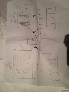
These are my first visual thoughts on paper about the 10 products I found it really useful to just put as much imagery down on paper as possible just to get the ball rolling and ideas flowing for this project


These are further design sheets which I have developed from my intial ideas  from before. I have tried to explore as many ideas and responces to each.