Wednesday, 21 November 2012

PRINT MANUAL : FINAL CRIT


From this final crit I had not printed out my print manual but had completed my PDF version and had my print finsih samples which got good feedback. Things that were pointed out to me were 

- no numbers
- layout issues such as things not quite being aligned right
-adding more colour 

I am going to experiment and try ammend the above and resolve my print manual, as I am happy with it but I am now aware to the issues.

WEBDESIGN : INITIAL IDEA / SCAMP CRIT

The website I am going to produce will be based on Stephen Fry. 
My audience will be Stephen Fry fans, who are web users, and enjoy learning facts. 
The website will include facts about Fry that I found out during the summer project. These facts will be about:

- Education
- Personal
- Showbis
- Stats

Initial Scamps :


Scamps for crit


Really useful feedback on my scamps. I now know that my scamps apear to have good usability, and giving off the clean simple look I want to achieve. other things that were mentioned were things like concideration of colour, font, size etc which are things I am going to imediatly move onto


Sunday, 11 November 2012

PRINT MANUAL : CONTENT / RESEARCH

Print and Finish:


Production for Print :


Material, Process, Print :


Books:


I was begging to get chocked up by the internet as there is just too much on offer, so decided to get some books to aid me in my knowledge for the content of my manual. This really helped as I could see the different structures they used in their books, and how they handle the same topics but differently.


Saturday, 10 November 2012

PRINT MANUAL : imagery for book

Imagery:


As the content and subject of print is quite a specialist topic and could get a bit heavy for someone who is new to it, I have decided to keep my imagery really simple, as I do not want to over crowd the page and overwhelm the reader. The simplistic style also give the a professional look but without seeming overwhelming.


I am going to use some imagery I got from going to visit Fine Print, as it is a far sight to see industrial printers especial lipho printers as so many printers have gone digital (boo). To maintain the simplistic style of my manual I have decided to monochrome the images  so that they all work in unison.


This is an example of what a different pt size can make. I originally thought the boldness of the dots would work well as it makes the colour very bright, but it just doesn't work composition wise, it looks clumsy and bulky, and doesn't fit with the thin lines of the drawings. 


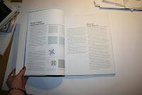
This is an example of the layout I have chosen to use. To maintain an easy to navigate and take in manual, I have kept the the text in the same place throughout the book. This way the eye will automatically know where to look when looking for text / info. As the text is all in one colloum it also appears more managble, and will therefore make the reader feel more at ease.