
After the crit I decided to revisit the stamps as I felt the crit feedback was very valid and I need to address the points made.
I want to make my message as clear as possible, and make them look more like stamps.
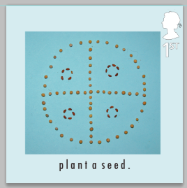

I need to add more of a concept as the message 'plant a seed' is very brief. I need more to it.


In the above stamp the message is more clear but there is still too much going on which makes the stamp hard to read clearly.

I like this layout, but I don't think it works very well with the imagery. In the crit the point was made that the patterns are distracting, although they have concept and meaning people won't recognise that and may just notice a pretty pattern rather than the message, so I will now experiment with stripping the pattern.

This is a close up of one of the seed patterns. I really like the way there is texture to the stamp now as it is so close to the seed you can see the detail of the seed and paper. the simple white text and white queen also make the overall stamp easy to read. I will stick with this design as it works well, and will put the message across simply and clearly.
No comments:
Post a Comment