
Netflix : hate

I don't neccesarly have a problem with the aesthetic design for the netflix website but I do have a problem with the navigation of the website. I find it pretty imposbile to grasp exactly what films/programs netflix has to offer as it feels so unsystematic. If you want to find something to watch it usually takes your longer to find something then to watch whatever you eventually choose. I think this problem would be resolved if they had a tool like an A-Z of everything they have in each category rather then having to reel through reams and reams of thumbnails.
It's nice that : love


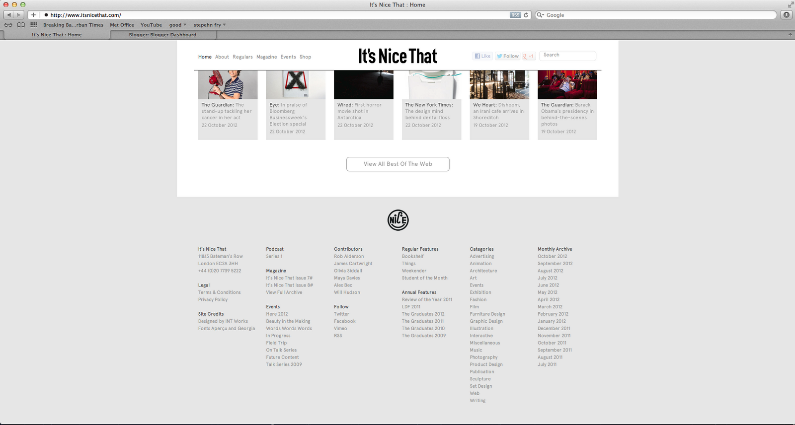
I website that I think works well is It's nice that. It's simple clean layout makes this website easy to navigate around and it's simplicity also bodes well with showing off the work that they are showcasing. There is no advertising on the website except the ocational design related advert, this is very refreshing as so many websites are covered in unattractive irelavent adverts. The website is also really easy to use there is a search box to search for whatever it is you may disire, and at the bottom of the page there is a break down of areas of interest which is really useful.
Design work life : hate


Design work life is a similar website to It's nice that in the way that it showcases others work. Although the work it shows is really interesting and of a really good standard, the website let's this site down. It doesn't look very professional and if I didn't know the work it shows is really good and just ended up on this website by chance I would assume it's taste in work wouldn't be too amazing. The website look isn't too upsetting in hindsight though, the search and navigation is. When you search something in the search box like 'books' or 'web' it comes up with the search results of past posts about those items but it does not show thumbnails so you don't know what is what, you have to click to see what the design work is like and this lengthens the process of searching for a specific thing.
Cattlemen's : hate


This restaurant website is over crowded and not good. This is a very popular restaurant with a very good reputation, but this website does not do it any justice or favours. the quality of images is poor, the use of images is poor, the actual logo is pixelated and there is just too much going on, it is hard to navigate and confusing.
Aleksander Komarov : love


This website is very interesting the minamilitc look is really different and the use of no obvious columns that most websites conform to works really well. I'm not sure wether it is too simple or what would happen if this person's body of work grew larger and larger how the layout would work then. But for now I think this is a unique and interesting website design
Pattern matters : bad


This website is very distracting as there is so much movement going on, constantly no matter what page you go on. It's distracting and uncomfortable for the eyes and doesnt aid the usability as it just makes me want to get off the website as quick as possible.
Emily Hadden : good


Good use of space, simple layout, simple use of colour and easy to use navigation. This website is easy to use and aesthetically good to look at.
Systems of space : good


Simple easy to use, clean. Although the style of layout does remind me of the type of layout you would see on Tumbrl which is not something I'd purposly try and mimic for my website as websites are expensive and tumbrl is free so if somone else was designing the website I'd want my moneys worth and not just to look like tumbrl.
bänziger-hug - love


really interesting layout and feel to the website. Easy usability and rememberable look. The use off things opening up large with a click then going back down is really useful and makes the website less clumbsy going back an forth all the time. Clear navigation bar at bottom.
Bullwrinkle : hate


This website is just too much. I quite like the backgrond peach colour and subject matter of Bulldogs but apart from that it is awful it's hard to navigate, it's ugly and cramped and just looks like it hasnt been designed. I would not want to stay on this website I would find it very frustrating.
No comments:
Post a Comment