
Idesign is the last piece you use before sending things of for print.
always set up your file :
File > new > document (even if you are doing a book)
Set up:

page size : what is the finished printed trimmed size of whatever you are printing ?
columns and margins: will apply guides to the page which will assist you with layout
> click on more options
Bleed : anything that goes to the edge of your pages extends it by whatever amount you enter, so that
when trimmed down it won't leave a white mark. Best to discuss with the printer what bleed
they would advise. Standard value is 3mm
Slug : another area that sits outside of printer page and is used to mark things like crop marks,
registrations marks etc
number of pages: set up appropriate number of pages can be multiple
Facing pages : if you are making a book format piece of work select facing pages
InDesign primary purpose is for print, but you can now use InDesign for web and for digital design such a iPad
Primary text frame : automatically links text frames together and fill the document.
Black line is the page, blue is the slug (everything will print up to the blue so you can add aditional info up to this area, red is the bleed, pink is the margin.

Facing pages documents always appear with one single page at start and finish this is front and back.
When you apply colour in Indesign it must be applied through frames. they can contain text, images or just colour. You can choose any shape.

colours are found in swatch pallet filled with the basics.

The grey box indicates the colours are global
Colour is applied in the same way by either editing the stroke or the fill. If you want to edit the colour of the text in a frame then click the T box in the pallet

When you create new colours in InDesin it is very important to make them into swatches


If you look down in colour mode section you can see all the spot colour libaries.

To create tint swatch in InDesign select one of the swatches and then look in swatch pallet menu you can select new tint swatch.


one of the important things when design for print using InDesignis the preparation of images for InDesign, and incorrectly prepared images cause problems for print.
Check list:
Photoshop :
- images must be CMYK or GREYSCALE
- resolution must be 300dpi
- actual size, must be right size so you don't re-size in InDesign as is lowers the resolution increasing it
- must be saved as a PSD or TIFF (choose PSD if image is layered, which allows you to play with
transparency)
Illustrator :
- must be saved as AI (you can also copy and paste directly into Indesin)
- CMYK or GREYSCALE
you re-scale in indesign with illustrator as it works with vectors so there is no resolution.
With every new document the swatch pallett reverts to the default.
to place image :
File > place > folder


any spot colours that you use in photoshop or illustrator will automatically be added to the swatch pallet.


Images wont look very sharp as you get a very low res version on InDesign, but when you print it will print how it looked in InDesign

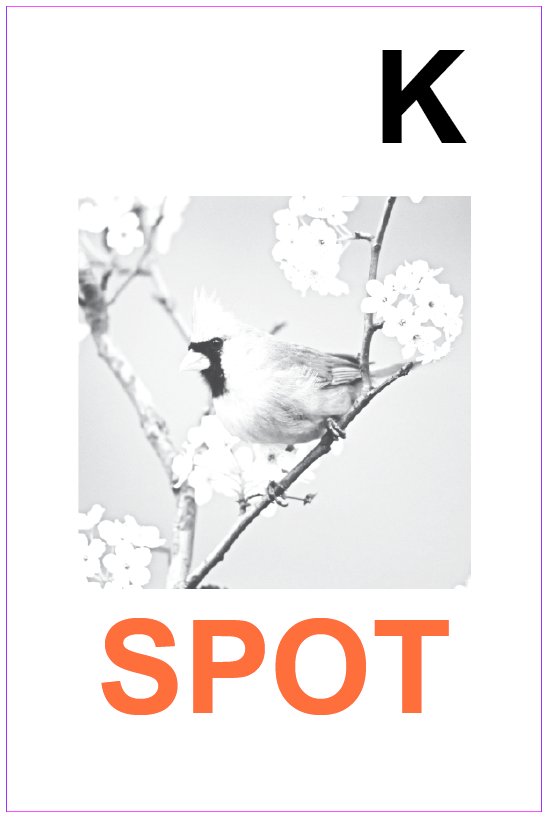
to make a mono tone style image use a greyscale TIFF image and select the image so it is highlighted with brown outline then click on your swatches and it will change to colour to whatever swatch you click on


To edit the original image right click on the image to get the following options:
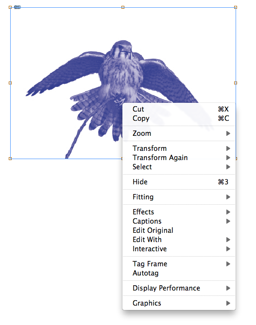
Or click the ALT button and double click on image for shortcut.
Change background layer into a normal layer by double clicking select the back ground using magic wand and press delete and then: save as > psd > make sure layers is selected > save


and then place in Indesign as before.

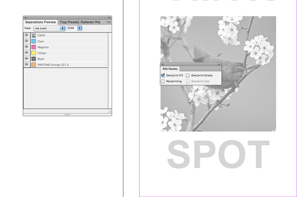
(with offset lino each C M Y K has it's own plate and then if a spot colour is used that also has its own plate)
InDesign can separate all these layers into what would be the different plates
Window > output > separations preview

This is how you can create images ready for screen print in the layers.

switch off ALL other layers to see this.


Similar process to Screen printing each greyscale image for CMYK and SPOT colour plates are printed onto plastic and exposed onto the aluminium sheets.

the above three spot colours that are selected are not being used in the design work. It is very important to delete these colours as they have not been used but you would get charged for the exposure of them.
To print the positives go to Print > output > colour : separations > print.


You would only do this if you were printing for screen print as in the commercial world the printers would do this for you.
frequency can be away to make something more half tone effect so the lower the frequency the more visible the dots will be.

Knocking out and over printing: If two colours are overlaid the yellow ( which is on top ) knocks out the blue. They do not overlay.
For spot varnish select a spot colour and let the printer know that you don't want that colour printing you want it spot varnish. But the item you want spot varnished will cut out the image below.
Window > output > attributes > select over print.

Always check with the printers that it is ok to change things in this way. as it could be that there might be too much ink applied to paper there is an ink limit in the commercial print world. In the separations pallett there is an option to see the ink limit, which is displayed through greyscale the lighter the grey the less ink applied if too much in is going to be applied it will warn you by showing the areas as red.
Over print stroke is something where two spot colours are overlaid RESEARCH TRAPPING
No comments:
Post a Comment