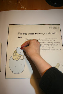
From my summer research I know how big a fan of twitter Stephen Fry is, it is something that he has been a fan of from the beginning, he describes it like writing poetry. Due to his passion for twitter I have decided to do my promotional material to promote twitter using Stephen Fry.
things to do with twitter:
- bird
- followers
- blue
- personal
- word limit
- hashtag
- celebrity
FRY
things I can relate to fry:
Fry supports Norwich city football club and is on the board so he is often seen representing the team with the norwich city badge which is a yellow canary bird.
This is an idea I want to play around with further.
- bird
- football
- egg
- yellow
- home
- personal
PRODUCT
For my promotional product I want to make something that is quite obscure and will make you question it, as this is what Stephen Fry is all about, he loves asking questions and digging deeper. So from my research and design sheets I have decided to make my product 'twitter eggs'.
after researching what method would be best for making a solid egg I have decided to make salt dough.
I will paint and varnish the salt dough afterwards to give them a life like egg look.
Salt Dough time:
So that the eggs will directly link with twitter I have decided to add the twitter branding. This way people will instantly recognise what the eggs are promoting, but will still question why? Which is what I want to achieve.
For my Flyer and poster I want to stay on the same line of asking question, questioning why there is a yellow canary bird promoting twitter make people want to know and research all the puzzle pieces. The Flyer and poster need to be a bit more obvious than just an egg with a twitter logo which is pretty cryptic, so I will add a reveal factor to them, revealing in someway that Fry is behind this promo.
The simple layout and concept behind the above design works the best I feel. I may have to add another feature of twitter onto it, say a logo or website just so that the audience knows it is in conjunction with twitter.
End product :


No comments:
Post a Comment