Feed back from crit.
- good imagery
- strong concept
- looks a bit too much like an exhibition poster
- be more brave with imagery
- imagery may be a little abstract, reader may not understand the concept or may start to see other objects
within the photograph.
Need to do:
- experiment more with layout
- get rid of text
- make photograph more obvious that its from inside puddle
-get rid of flag
- Simplify right down.
Sunday, 26 February 2012
FINISHED PIECE
These are the finished set of posters. I think they do what I set out to achieve, by making people look at rain from a different angle and see the beauty of it.
DESIGN DEVELOPMENT.
3 poster variations.
I like the layout of this poster but I don't feel the layering of the image in the background is very strong it kind of detracts from the foreground image and makes the overall poster look a bit wishy washy.
I thought I'd try a rain drop effect releasing the image behind in the background, but I really don't think it works, I think it over complicates the poster and makes the whole thing hard to read and work out what it is about.
This is my favourite lay out. I think the simplicity works best as it puts all the focus on the image and text. I decided to over lay the same image to give a rippled puddle effect to the poster. I will now extend this kind of lay to 3 posters.
Thursday, 23 February 2012
PHOTOGRAPHS
As I want to represent from a positive angle, I need people to change there perspective of rain, and thought the best way to do that would be to literally record the rain from a different angle that no one ever sees it.
I took these photographs using a waterproof camera. I took the pictures from inside a puddle looking up on the incoming rain. I really love the way these photographs have come out the colours and shapes are really beautiful.
THINGS TO DO WITH RAIN I LIKE
When I was little I used to enjoy the rain, and thought it would be a good thing to remember what I liked about it.
Rain sticks.
I think rain sticks a really interesting things, the fact they are dried out cactus with their pins inside that make the noise of rain. I also love the decorative patterned fabric that gets tied to the top of them.
Rain house
Again I find these weather houses fascinating, I don't understand how they can predict the rain. But I think they are really fun.
Heavy rain.
Theres nothing better then big fat raindrops and how refreshing they are (along as your not on your way to somewhere) and when it is heavy rain its a great excuse to stay inside and have a cup of tea.
Snails.
When I was younger I was fascinated with snails, every time after it had been raining I'd go outside and try and collect as many snails as possible on my hands and then race them. There're bizarre little creatures and thats what makes them great.
Tuesday, 21 February 2012
RAIN DESIGN RESEARCH
As I want to take a new approach on rain and alter people perspective of rain, I researched ways of recording rain. I decided to make Ph indicator paper which changed colour when acid or alkali is present, and from doing research I discovered that rain will show up on this paper and alter the colour.
(never realised how interesting the inside of a red cabbage is)
I soaked the paper for a couple of hours then left it to dry.
It works!
I tested the paper fully worked by using something very acidic, a lemon, and sure enough the paper changed colour to a very bright pink. I also tested alkali by using a small amount of bleach just to see what colour the paper went, it turned green.
RAIN IMAGRY
When I typed english rain into google image search this is more or less what all the images of 'rain' looked like. I don't think this gives a very positive feel to english rain. All the pictures are grey and dreary and are showing negative things such as flooding. I want to steer well clear of representing rain as a dull and dreary thing.
RAIN
Spider diagram to show what I associate with rain and the positive that comes from it. This is to try and find a strong positive way to represent rain.
Wednesday, 8 February 2012
END OF MODULE SELF-EVALUATION
NAME: Suzanne Moore
k
| ||||||||||||||||||||||||||||||||||||||||||||||||||||||||||||
PHOTOSHOP POSTCARDS
The colour I chose was green and the images I chose to work from were theses...
where the person who was assulated goes into great detail I wanted to take this and tell the story through the post cards.
I started off by researching into people opinions of the green power ranger but I didnt find myself getting anywhere. I then discovered that the actor who played the green ranger is now a pro fighter. On finding this out I then discovered that he had assulted somone who worked at the place he was fighting in, because the guy accused 'frank' (green ranger) of stealing a glove. There was a very bizzare article about it here...
where the person who was assulated goes into great detail I wanted to take this and tell the story through the post cards.
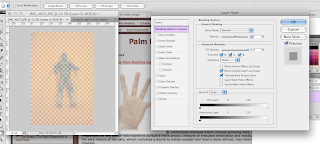
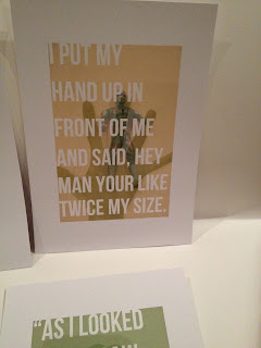
I made my images by using the tools to change the opacity of the image infront and then changing the colour variation of the image behind. The images behind help tell the story of the assult and the image in forground is the green power ranger. I then used quotes from the article to illustrate the story further.
Subscribe to:
Comments (Atom)


