We have been asked to bring in 5 examples of Branding and Identity that share similar concepts to what we have in mind for our Good Is. My Good Is, is not a concept where I can bring in physical branding for it , but in terms of the way I want to take it, I have decided to look at branding to do with cities and exhibitions. We have also been asked to look at and find 5 examples of print that has aspects that I want to explore in my project.
Branding and Identity -
Leeds Inspired:
This is the branding and identity for Leeds inspired. It is a very clean and simple branding, but it is also clever with the L and the i merging together and by being clever it represent the creative side of the branding and the company being branded which is a creative company.
The use of the stamp gives a tactile finish, and because it has a hand rendered quality to it, it feels more creative, a computer hasnt generated it, you personally have stamped it.
The stamp also ables you to play with how you want it to look, and playing is also alot to do with creativity. You have creative freedom to do as you please with the stamp.
Hello - Leeds :
This is the branding for an exhibition in Leeds art gallery all about exploring the city in new ways. It is aimed at children, which is very clear by the branding. The branding is very rounded and friendly, so that children will notice it and find it interesting, this is also the reason why the use of bright colours has been used.
The branding uses illustration within the products such a the exhibition guide, this will apeal to the child more, as it is fun and exciting, and somthing that they could interact with if they choose such as copying the drawing or colouring it in.
Comparing the branding of Leeds Inspired to Hello, (which are both done by the same person) it highlights the point very nicely of how important audience is when designing branding. If Leeds inspired was done in the same aesthetic as Hello, the effect and visual identity and representation would be totally different. Capturing the correct tone, audience and identity of whatever you are branding is so important, and will be something i bare in mind when it comes to the practical side of this module.
City Sightseeing :
This branding is very bright and in your face, which makes it memorable and recognisable, even if it is not aesthetically pleasing you still recognise it and know what it is for, which is what they probably wanted.
Visit Leeds :
The Visit Leeds branding is very simple, but due to its simplicity it can be aplied on different levels such as below, it can easily be altered to Leeds live it love it, with it still being recognisable to the visit Leeds branding. This shows how flexible branding can be to be aplied differently.
Visit Manchester :
The Visit manchester branding is more visualy aesthetic and capturing than the visit Leeds branding, which makes the visit Manchester branding more iconic and memorable. It also has a strong concept and meaning behind it wich highlights how effective having a strong concept is -
Visit Kiew :
Another example of branding that can be altered and aplied differently to get different effects.
Hello Zuidas :
This branding might be effective where they are but the use of layout and typography has a strong correlation with Kellogs branding. This is an example of what to avoid when brandning projects, you can't use antyhing that is similar to a big brand (unless it is for a reason) as that big brand will be reconisable and your brandning will just remind people of that big brand not make yours memrable.
Young Designers Kit :
I have looked at this not so much for the brandning, but for how it has been applied creativly to a range of product. Often you see the branding just the logo plastered over as many items as possible, but this uses the branding differently, it creates the range by using aspects of the branding so it all matches and is recognisable, but uses different words. This is useful to see to show that you can be creative with branding and applying the brand to products.
Print -
OK :
This is a screen printed booklet that also folds out to make a poster. I lie how the the booklet has a secondary purpose, and would like to achieve this in my work as it brings another eliment to the work making it interesting. I also like the process that it has been done in , screen printing, it gives it a lovely quality feel and makes the booklet more of a tresured item, compaered to if it was just digitaly printed. The audience for this would be someone who is interested in print and illustration, due to the fact it is screen printed it is a tresurable item, which would make a good gift.
Give us a sign :
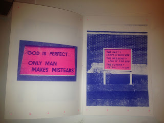
Give us a sign is a Riso print book. The colours are really vibrant and strong the riso gives a a great effect of flat strong colour, like screen printing . The booklet is really striking and memerable due to the colours and finish of the risk. I am interested in experimenting or researching into riso further. The audience for this booklet would be someone who is interested in Zines and DIY prints. They might have an interest in riso printing, or an interest in the subject matter of church signs.
Exhibitions :

This is an exhibition guide, which can be found at Leeds college of Art, so the audience for this is people associated with college, who have an interest in the creative goings on of the college. I really like the use of the cover insert, and the spot varnish effect on it.
KG packaging :
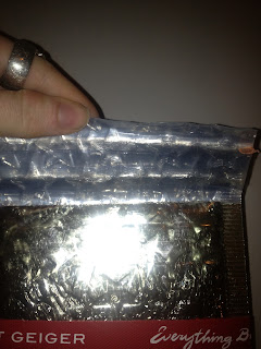
This packaging is not too pleasent to look at, but it is interesting to look at how it has been made. It is a shiny pouch that a braclet came in. The packaging is very padded, using a bubble wrap kindof effect but in star shapes, which shows the the item inside is a treasured item and delicate, but not amazingly pricey as it is just in a pouch not a box for example. A lot of thought and processes have gone into this packaging.
Skate Magazine :
This is a skate magazine that has some really interesting features. The first being the format, it is quite unusual to have a big thick book in this narrow long format. It makes it very unique looking.
Another feature that is interesing is the tactile finish of having the bind on show. This is something that is usually hidden away, so I think it is a rare treat for it to be exposed, especially as i am interested in book binding
To expose the bind comes off, and on the other side of the book cover is a poster. This is a really good example of how succesful secondary purposes can be.
This book is concpetually and creativily very strong, I would hope that my design can capulate that effect when it comes to designing. Say for the research book, I dont want it to just be a bog standard book I want it to have a concept and be unique , like the above book achieved.
Crit Conclusion :


No comments:
Post a Comment