
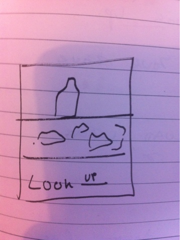
Posters :
These are my end posters. I decided to continue with the posters as they were as I think they are visually striking and will make my audience think. I wanted to screen print these posters and got 3/4 of the way there but hit a problem as the screen I was using was blocked with glue which you can't tell until the screens exposed and washed and by that point it was too late I didn't have time to start the process again and I didn't have another day opportunity to visit screen printing again without getting behind with the the production of other products. So made the decision to scrap screen printing this time as time has won the battle.
If I was creating this project for real I would screen print my posters, but for time purposes I shall just print them out digitally, but they will not have the same effect as I have designed the posters specifically for screen print, half tone, lo-res two things that come out well in screen print but not too good digitally but it will have to do.


Exhibition Leaflet :
I have decided that I want to try a different format for my exhibition leaflet as from research I have found every single exhibition leaflet tends to be in the same format. So I have decided to experiment with a hotdog fold for the exhibition guide with the exhibition poster on the other side.


After trying this format for the guide I have decided to not use it for the exhibition leaflet as it does not feel appropriate, exhibition guides are often something someone keeps as a reminder or keepsake of the exhibition so I have decided that it needs more of a durable, luxurious finish to it. I will however use the hotdog booklet for the flyer instead, as this format feels more appropriate for flyering.
The format the exhibition guide will take now is a stitch bound book with a outer tiping. I will use the same design as the previous format but as I know have more pages I can include more information, like a warning page.


This format works a lot better for the guide, it feels more respectable and fitting for an exhibition. It is also something now that someone might keeps as a keepsake.
Dérive cards :
For my dérive instructions I have thought about many different formats to put them in such as a booklet, a dice, concertina, but I think the most successful format I came up with was in the style of a pack of cards. This way my audience will be able to shuffle the pack of cards to generate a new journey each time. I want the pack of cards to be simplistic and match to the identity of the exhibition through colour.


Bellow are examples of the cards. There will be 25 cards in each pack, as there are 25 photographs on the film cameras that are loaned out so each card will lead to a photograph.


I want the pack of dérive cards to look like a high quality product so will be creating the bode through book binding material and grey board.
Map :
For the map of leeds I wanted it to be playful and use the same lookUP concept as the research book, where you have to lift it to the light to see the text. This time it would be lift it to the light to see the street names. I found a map of Leeds and re drew it out using the identity colours so that everything works in unison.

Once I'd drawn out the map i needed to invert it so that the text it white and everything else black


mock ups -

I checked that everything was lining up and working by printing out the may on a4. This is not the size the map is meant to be so the text was very small, but it is clear its going to work out.
I realised after this experimentation that paper is really impotent for this to be successful. so far I have just been testing and mocking up using standard printer paper so the quality has no been very nice, but I wanted to try nicer stock, bulky newsprint for example bellow.


This is when I realised the paper needs to be slightly translucent so any think paper is not going to work. which at the time was quite an issue. I then researched into paper types and found layout paper sounds like my best option so came to uni bought it , tried it , and it worked perfectly.
Exhibition book :
The photographic exhibition book is going to filled with the photographs I have taken from the LookUP x Dérive trip I went on. I want the layout to be very simplistic with not a lot going on so that the beauty of the photographs can talk.


I have decided to include reasons why it is good to look up in the book as it is a fun way to promote looking up as some of them are quite abstract.

For the bind of this book I am going to use stitch binding and then use the paperbacking grey board and exposing binding tape ( see research for this bind post) to create this book as it will add a quality and unique feel to the book.

website :


Above is a quick site map of what I would want the website to include. I want it to be as simple as possible as this is something that would keep costs down , and this is a low fi exhibition.

This page would be the home page of the website. I have kept the same colours as used for the rest of the identity to keep the unison going between the range. The website would be very simple and user friendly, nothing jazzy going on. The navigation bar runs along the top so it is very clear and easy to use.


the band running along the middle is influenced by the use of sky belly bands in other items of my range.


This page would have a scroll function and would showcase the LookUP event and show case the D´rive x Look UP journeys that people went on.
I need to add a few things to the website as i think it is a little bit too simple with information like missing Facebook and twitter links. I also thnk i need to as a mini description to the home page so people know straight away what the sight is about and wether it is relevant for them
Tote Bag :

I have used the poster design to put on the tote bag that the lookup kit would be supplied in.
Suzanne Look Up from Suzanne Moore on Vimeo.
This is a mock up of how I would want the projection to look on the ceiling. I have made it by using footage I found from an old super 8 camera and teaming it with my photographs. The images flick around the black screen to cause eye movement and make the brain work bialarerly so it puts you in a happy frame of mind.
neck brace :

As a gimic product I am going to brand a neck brace as a sftey precaution, since with all the looking up you could easily strain a muscle.
No comments:
Post a Comment