
From doing research into postcards theres lots of little bits to think about like how I want to have the line seperation, do I want to have a line , any text etc. So i'm going to have a play around


Logo design:

These are my initial designs for the logo, the two that I think work the best are bottom right and bottom middle, they show the question mark the clearest and give the clearest messege as you dont have to think what are they?
Experimentaion for postcard:


I want to keep the postcard simple so that there isnt too much going on on the page with the design, plus ilustration, pluss fact. I will decide once I have some drawings to play with.
Drawings:

Illustration applied to postcards:


Experimentation of text placement. I still think that the text plus logo, illustration and fact once thats put on will be too over crowded. I do think it is important to have the title for promotion reasons but on the other side which will be without the fact and illustration.


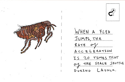
Im going to simplify the design futher and take away the circle from around the logo and leave it just in the rectangle. The above is how the postcard will look with the fact. I have chosen to handwrite the fact so that the postcards have an imperfect, hand rendered feel, so it will encourage people to write, scribble, draw do whatever they want to illustrate their fact. people will be able to relate more to handwriting. I now need to decide how I want to colour the drawings.
Digital vs Hand:


above is a digitaly coloured in illustration done through photoshop and the other is coloured in with water colour pencils. I like the look of the water colour pencils but i like strength of the digital. It is also alot quicker to colour in digitaly and I do want to bring in digital elements like the logo so I have chosen to colour in digitaly.
Example of digital colour:


No comments:
Post a Comment