After the crit last time I decided to enlarge the side colour key. I also noticed that everything was too far to the left so played with my sizings so that everything was more equal.
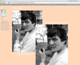
I have now created all the pages that fry's face leads onto. I didnt want the pages to be too full having text and image in copious amounts so decided I wanted to find a way of opening and hiding the text with a click. I searched high and low on the web trying to find how to do this and eventual found something about toggles. I grasped a basic understanding and was able to apply it to my website, but I still don't fully understand it so this will be something to look further in to, although I am really happy that is has managed to work. The pages now have a sleeker feel to them and are not too over crowded.
The below page is made enteirley of individual pictures of Fry's ties from all the seasons of QI so far. This was a long process as I also wanted the images to open up when clicked on to reveal whole image of Fry wearing that tie on QI, so used lightbox2. Happy with how this page has turned out altough the layout feels a bit off like it is a bit to the left but, overall I am pleased it has worked out.
I also decided to use lightbox on the indedx page as I didnt want everysingle fry head to lead to a page as some facts didnt need illustrating just simple text would be enough so I used light box link under the image for the fact.


No comments:
Post a Comment