
Brief :

Key words :


List of the animal in The wind in the willows:
- Mole
- Ratty
- Mr Toad
- Otter
- Weasel
- Stoat
- Ferret
- Fox
- Squirrell
- Rabbitt

Concepts :

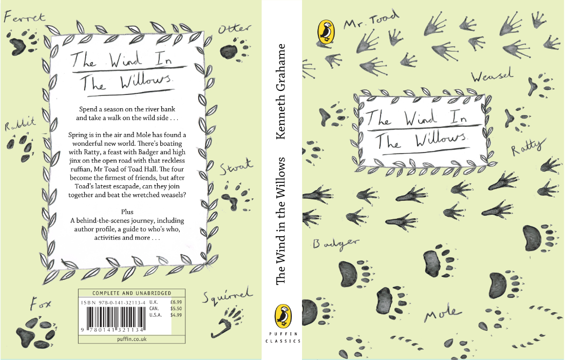
- Cover decorated by leafy boarder and featuring silhouettes of the four main character - Mr toad, Badger, Ratty and Mole.
- Cover with illustration of the four friends walking along.
- Illustration of a chosen scene from the book.
- Illustration of a chosen scene from the book, but left as just a line drawing so that the child can colour the cover in how they want it to look.
- Same concept of colouring in, but instead child gets to colour in the main characters.
- Silhouettes of the characters from the book decorated around in a pattern.
- Foot prints of the main characters on the front teamed with leafy boarder design.
- Scatered pattern of footprints of all the animals featured in the wind in the willows.
- Foot step pattern of the the animals footprints walking. On the front cover featuring the main characters and on the back the rest of the featured animals.
Footprints :
I have deicded to experiment with concept 8 & 9, the foot print concepts, as I feel this is a good way of representing the animals but without hindering the childs imaginations. The child is still able to imagine the characters how they personally see them in their heads rather than been given an illustration of the character and imagining that. It is also a way of the child learning animal foot prints.
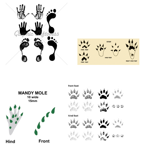


Above are all the footprints of the animals featured in The Wind in the Willows. All the footprints are very different which is interesting and will work well in the pattern as you will easily be able to distinguish each animals footprint.
Water colour pencil drawings of each animals paw print :


Colour way :

Above is a classic illustration from The Wind in the Willows. I have taken a colour swatch from the illustration to link back to the classic drawings.


Design Process :
Concept 8 :

This is the concept of having the footprints scattered of each of the animal. I dont think it works well. It appears too messy with no structure, and the footprints are not evenly distrubuted so there are more on the back then the front which does not work. The contrast of the prints on the background does work well thought, and makes the stand out.
As this concept has not worked very well I will move on to the more structured concept of having foot prints in a walking fashion.


This concept is working alot more. The look of the walking foot prints has more naritive behind it and makes you think they are characters rather than just examples of animal footprints. By adding the name of each animal is also adds character, and will help the child identify who's footprint belongs to who.
Out of the two variations above I feel the boarder with the leafs is stronger. It adds a more illustrative, fictional, whimsical feel to the book which i think it more suited to the story, rather than just a box.

This is the finished cover. I am happy with it I feel it represents The Wind in the Willows well and has been designed with the classic illustrations in mind playing homage to it. It also allows the children to learn about the animals they are reading about and also use their imagination to conger the characters in their mind.
Mocked up :
Front :

Back :

Above is how the cover would look on a book, front and back. It is useful to see it mocked up as it confirms that as a cover it would sucessfuly work on a book.
Further development :
From our final crit where we looked at all the projects we have done in this module I got some feedback that I should extend a project. So I decided to extend The wind in the willows.
Poster :

This is a poster featuring all the animal foot prints from The wind in the Willows, which would come with the book. It is an educational poster so that the children can learn about animal foot prints.
Book mark :
Animal facts book :
To continue the theme of education I have decided to create an animal fact book focusing on the animals featured in The wind in the Willows. So that there is a coherent flow between the range of items I have continued with the footprint theme but adapted it to suit the fact book. As the book is for children and is educational I have decided to make it colourful so that it looks fun and exciting.
For the colour theme I have refered back to the swatch from the classic the wind in the willows illustration and used variations of those colours.
I am glad I came back to this project and developed it further as I feel now I have more of a substantial range, and have gone above and beyond the brief.
Fact Book :


No comments:
Post a Comment