


These are two posters that I have pulled from my design context blog. I really like the use of the two colours against the black and white images. This is something I want to incorporate into my designs as the majority of the images I will be using will be in black and white.


I have decided to pull the colours from the two posters and experiment with them in my design work as I think they are strong with the black and white images, making the image stand out but not looking too garish.

I will experiment with each colour and then decide which one (if any) works / is more most appropriate to the design. I will also experiment with fonts/layou to see which works the best
Colour 1 :


The above experiment with the colour are not successful. The colour is too light against the white background, making it un clear and not very legible. The colour also doesn't look very strong, which is what I want it to do as it is a representation of Winston Churchill. I will try the colour as a background to see if the intensity and feel of it changes.


The colour now is too sickly in a large volume. It doesn't represent Churchill how I want him to be Bold, Strong, not pasty, sickly , wishy washy, so I will scrap this colour.
From experimenting with the fonts I have decided that Courier and Edmonsans are the most successful. This is due to the fact that Courier is a font that I feel embodies the era of Churchill as this type writers were used back then, and Edmonsans as this is a font that has a lot of quirky characteristics, as Churchill did.
Colour 2 :


This colour is allot bolder then the other colour, which is the look I want to achieve. It is strong and powerful, but without being too garish. Red is a colour that humans are drawn to, so it will get peoples attention. As a full background colour however, I think the colour is too much and detracts from the black and white image of Churchill, where as I want them to complement each other, so I wont be using it as the background colour of my work, but will experiment with the text colour.


The colour works a lot better as a text colour. It is not too intense in a small quantity, it is bold and strong and stands out well on the page.
I have been experimenting using different fonts throughout the experimentation's with colour. After whittling it down to a choice between Courier and Edmonsans I have decided to use Edmonsans for the titles as it is the strongest and represents the quirky look of Churchill, and will use Courier for the copy, to play homage to the era of the type writer that Churchill was around in.
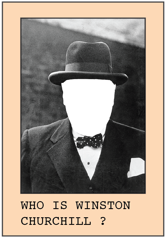
Pack design :


This is how I want the envelope of the pack to look like. The missing face of Churchill adds to the mystery of who is he? but the classic iconic items of Churchill are still visible to start the recognition process. I want the face to be a clear cellophane so that you can see the contents of the pack, to incise the audience in.
No comments:
Post a Comment