Brief :
Key words :
Things I relate to tea towels :
- dishes
- washing gloves
- wrinkles
- prunes
- bubbles
- washing liquid
- pots and pans
Concepts :
- An image of a prune with the message 'Wrinkly as a prune'.
- wrinkly hand that has gone like a prune because it's been in the water so long. With same message as before.
- When I wash up I find the most exciting bit, stacking the things to dry. It's risky business and you can stack them so high like a game. This concept is illustrating that dishes stack, with writing 'stack them high'.
- When you've got wrinkly prune hands you normally turn them round and look at them. This concept is showing that action and the wrinkly hands.
- Similar concept to above but instead of have wrinkled hands like a prune, having actual prunes for finger tips.
- Tools of the trade - showcasing all the tools you need to successfully wash up.
Prunes :
Secondary images of prunes to get an idea of how wrinkled they are and the similarities to wet human hands they have.
Prune hands :
Secondary image of prune hands. The similarity to a prune is very strong, the wrinkles are just the same.
I am going to go with the prune hands / prune concept, as I think the way the hands wrinkley is very unique to humans, and to washing up, as this is probably where it happens the most ( unless you own a pool / live by the sea / have a bath instead of a shower.)
Colour swatch :
Aboves is a colour swatch of a prune. I will try and incorporate these colours into my design so that they represent the prune succesfuly.
Designs :
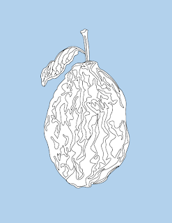
I began with concept 1, the single prune with 'wrinkly as a prune' message, so drew out a wrinkled prune.
Out of these colour variations I feel the simple line drawing ( top right ) works the best. When black fills the wrinkles it makes them too harsh and contrast too much against the white. The black wrinkles do look better against the coloured background but it is still too much. The line drawing is more subtle and simplistic.
It occurred to me that these tea towels are to be screen printed, so when it comes to colours it is best to keep the number down where possible, which is another reason to pick the line drawing of the prune. To add a bit of colour and make the prune stand out I have decided to use a background colour, which will contrast nicely with the white background of the prune.
Concepts 4 & 5 :
I am now going to try out concepts 4 & 5 where the hands are as if you are holding them up to look at the wrinkles of your hand.
Below are some primary photographs of that moment :
Prune hand :
Prune hand :
Finished design :
I decided to have the writing not as a main focal point as the message is clear, so it would be unnecessary to have it as a main part. I am happy with the overall design I think it depicts the essence of washing up well, and people will be able to relate to it.
Mock ups :
Apron :
As well as tea towels the design could also be applied to other kitchen necessities such as aprons, and washing up gloves.


No comments:
Post a Comment