Key words :
concept :
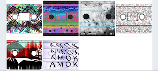
Using purely type, create a 'trippy' effect using the title of the tape AMOK.
The above is a digital experimentation to make a 'triply' effect from the word AMOK, by playing with the anchor point in illustrator. It has not worked well and is not the effect I was going for, it just looks messy and is not very legible. I will boycott the digital approach and experiment with hand rendered techniques, such as using the trusty scanner.
By printing out a piece of paper with black text saying -
AMOK
AMOK
AMOK
AMOK
and then putting it in the scanner and moving it in different ways I was able to get different effects and manipulations of the words, thus creating a triply effect. The effect of using the scanner is an interesting one I like the way the control is out of your hands you don't know how each will turn out, and no one will ever be exactly the same.
This is a cropped in version of the must successful scan in. It gives a very distorted effect, but it is still legible. There is a lot of movement in the image and it is hard to imagine what has caused the letters to bend as they have, which aids the 'triply' feel. I will now apply colour to see if this will make the look even more obscure.
Using colour replace tool I was able to manipulate the background colour and intensify the look. This gives the design a stronger look, which I can experiment with and try other colours.
The design must be submitted mocked up on the cassette given. The design fits well on the cassette, and because of the repeat of AMOK means that it is legible even where there are holes.
Below are the variations of colours I have experimented with.:
Some of the colour are too dark and make the writing not stand out enough, such as the 3rd design, although colour and texture wise this is probably the trippiest, it detracts from the writing which is meant to be the centre point of attention. The purple seems to work the best as it is a strong colour but it contrasts nicely with the black, and the effect and movement shows nicely through the shading of the purple.
This is the design I submitted. I feel it answers the brief it is a 'triply' design, but without overcomplicating the design and making it uncomfortable or attractive to look at.
Proof of submition.
Mocked up :
This is how the design would look if it was actually printed on a cassette.
As well as the cassette I have applied the design to a poster as an added extra to come with the cassette.


No comments:
Post a Comment