


Key words :


Haim :


I have chosen the band Haim for my secret 7" entry. Haim are trio of sisters from America who have recently come onto the music scene in the UK. They are known for their "nu-folk–meets–nineties–R&B" style and quirky dancing. They have recently won the BBC Sound of 2013 award, which has been previously won by such artists as Jessie J, Ellie Goulding and 50 cent.
Better Off :

The song that has been selected for the secret 7' task is 'Better Off' (lyrics above) It is a song about heart break and break ups, but with a more positive spin that even though it might seem bad at the time, you'll be fine and be better off in long term. I will create concepts that convey this message.
Concepts :
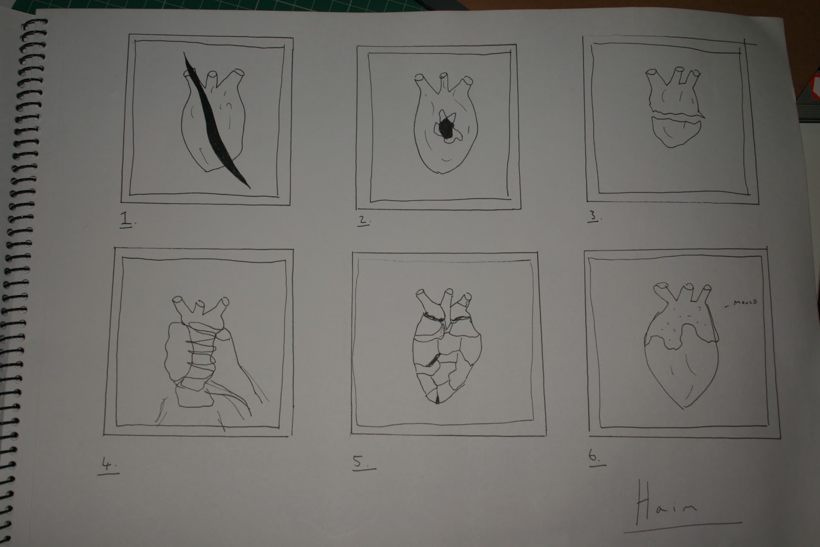
- Slashed open heart, showing power over the heart. The heart would be printed out and then slashed so that it shows a more conceptual power over the heart rather than gruesome realistic one.
- Concept two shows a hole in the heart shot through.
- Ripped in half heart
- Over coming the broken heart by squishing it in the palm of the hand.
- Ripped up heart that has been pieced back together to show that it might of been bad but you can fix things.
- Mouldy heart showing that sometimes things go wrong. If you had a mouldy piece of fruit you wouldnt keep it you would throw it away and get a fresh piece.
Photobucket :


I want to use a real heart in the design, as they are gruesome and will make the sentimental message less smushy and soppy. As part of the rules of the competition you must own the rights to use all images or whatever you choose to use in your design. So I had to make sure that the heart that I sourced abide by these rules. I found heart images on Photobucket which would work in my design and then searched through the T&C to find if I am legible to use the images as I please.

From searching I found that I can use the image as I want the above is the proof from the site T&c's.

To make the image of the heart more audience friendly I will change the image of the heart from colour to grey scale, by removing the colours it makes the heart seem less real, so people wont be fainting whilst looking at it / getting too distracted by the horror of it to then miss the concept. By making the image greyscale it will also able me to use more colours in the design without losing the effect and texture of the heart.
Ripped up heart : concept 5
The concept of the ripped up but pieced together heart is one of the strongest in telling the story of the song so I will take this concept further.
I want the design to have texture and an element of real life so I have decided to print out a full picture of the grey scaled heart and rip it up by hand and the stick it back together


Ripped up and stuck together heart then re-scanned in. The end effect of the heart works well there is a lot of texture from the rips and it looks real, as in anyone can relate to ripping up paper. The heart tells the story and concept well and the audience will be able to relate the song or there own experiences to it.
Shot heart : concept 2
This is the other concept that I thought worked well, so I wanted to try it out in the same style as the paper ripped up heart, but putting a hole through it instead.


I think visually this concept works well, and as before, the ripped paper adds a lot of interesting texture, although I think conceptually the ripped up heart works better for the song. I will try out some designs with the hole in the heart, heart, but will bare in mind the first concept is stronger.
Colour way :


First I experimented with type which worked but, I decided that I want the design to be as simple as possible and let the image do the talking, let people take what they want from it, instead of giving them the message straight away through text. The whole idea of the brief as well is to be secret, you are not meant to know who the vinyl cover is for, so I think the more conceptual it is the better.

This is the design for the shot heart concept, minus the writing. It is a strong image and I do like it visually, the way you can see the background through the heart works well and gives an effect that the paper heart is 3d and you could pick it up. But I do think the other concept work better for the song still. This gives the message of hurt, and negativity, where as the song is positive about the break up so I will definitely be going with the other concept.

This is the finished design which I am happy with, I feel it represents the song and the feel of the band Haim, it's dark but fun and positive.

Proof of submition to talent house.

This is the mock up for the vinyl cover, which was chosen as one of the winning designs so will be being created for real. I don't have time to go to London for the exhibition but hopefully there will be some pictures.


No comments:
Post a Comment